It's time for another research post...
Taking a break from story ideas, I have to tend to the print component of my production for a bit. I'll start this component as I'm editing and it shouldn't take too much time to put together if I plan things properly. While planning it, I have to take in consideration any sort of story symbolism and incorporate a bit to the postcard to make it engaging and meaningful to the film itself as I put together the graphics.
To the research:
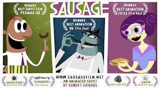
 I picked out two postcards that I thought was pretty interesting. For this first one, the title is pretty visible and readable with the white text on top of the desaturated and darker colors of purple and green. I find this nice that it stands out since I sometimes have to strain my eyes trying to read certain text when the text is any closer to the background colors (I may be exaggerating a bit, but my eyes really aren't very good, and I want to make sure people who don't have perfect vision can actually see the graphics). The overall postcard is very dynamic with the colors and shapes, which really seems to match the short's overall tone and style. The shapes and expressions of the characters shown also allows the audience to make assumptions about the film, for example how the character on the left is depicted with very round and simplistic features with a very happy open smile on his face which the audience can assume that he may be a very light-hearted, positive, and even comedic character to the film. The middle character possesses sharper features depicting an almost sinister smile with very narrow eyes and mouth, in which the audience may assume that he could be the antagonist. The purple lady on the left seems sweet, possessing rounder features like the left-most character. The postcard also leaves a decent amount of white space on the bottom of the card for the nominations as well as the website and producer in the middle. I really like the layout and choice of colors (and shapes, in the case that it's very cartoony) and will keep this in mind while I plan my postcard. Though my chosen genre and this postcard's genre is different, the kind of information that is depicted should be around the same.
This postcard... a lot is going on. It's eye-catching. The woman in the front is likely the main character as she is depicted to be in the front of all other characters, facing forward and confident (though being confident isn't really a feature all main characters have, it can be assumed that this particular character is). The postcard involves features that help the viewer guess what the film could be about. I like that the title is very large and obvious as well. Overall, this piece is very enticing and draws in the attention of those picking up the postcard almost immediately. One could guess that this film is a thriller by the way the overall tone depicted by the colors, angle of cars and positioning/poses of the characters, etc. The fog in the back also helps add depth and overall very closely depicts something that could keep their viewers on their toes...

No comments:
Post a Comment